

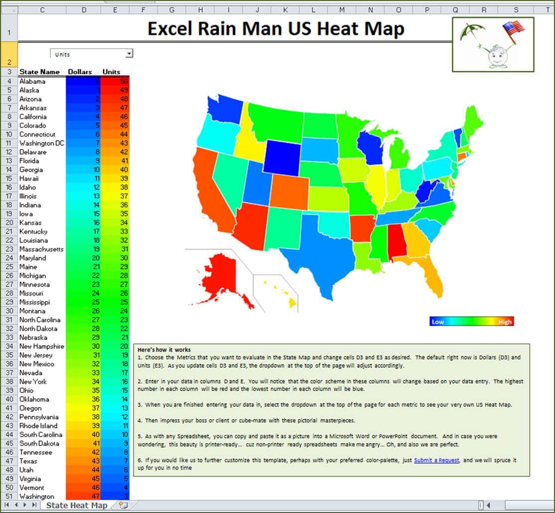
US HEAT MAP
While the Presidential Election seems like ages ago, President’s Day is just around the corner which got me thinking of the 50 Nifty United States when chatting with Excel Rain ninja, Chris Terrell. Regardless of what you do for a living, at some point you may find yourself in need of a Heat Map of the US… in layman’s terms this just means color-coding the various States, though the use of data, to create a state-by-state comparison for whatever the heck it is you wish to analyze! Fortunately for us, Chris decided to go Patriotic-Spreadsheet crazy one night and put together the nifty Excel Rain Man US Heat Map for your use whenever you want. Thanks Chris!
Here’s how it works:
1. Choose the Metrics that you want to evaluate in the State Map and change cells D3 and E3 as desired. The default right now is Dollars (D3) and Units (E3). As you update cells D3 and E3, the dropdown at the top of the page will adjust accordingly.
2. Enter in your data in columns D and E. You will notice that the color scheme in these columns will change based on your data entry. The highest number in each column will be red and the lowest number in each column will be blue.
3. When you are finished entering your data in, select the dropdown at the top of the page for each metric to see your very own US Heat Map.
4. Then impress your boss or client or cube-mate with these pictorial masterpieces.
5. As with any Spreadsheet, you can copy and paste it as a picture into a Microsoft Word or PowerPoint document. And in case you were wondering, this beauty is printer-ready… cuz non-printer ready spreadsheets make me angry… Oh, and also we are perfect.
6. If you would like us to further customize this template, perhaps with your preferred color-palette, just Submit a Request, and we will spruce it up for you in no time
Some key uses of this sexy heat map (other than worshipping Chris) include:
– Provides a color coded view of country-wide data
– Compare Dollar Sales vs. Unit Sales
– Compare Year over year sales figures
– Electoral college numbers from past elections etc. and compare it to who won the State (where 1 = Republican/Red and 0 = Democrat/Blue)
– Compare any 2 things you want!
Go to the Tips & Tricks page of www.ExcelRainMan.com to download the FREE Excel Rain Man US Heat Map. If you want us to customize the colors or the map more to your steeze… just Submit a Request and we can bepoke this heat map to your liking. Be sure to Enable Macros when you open the workbook.

Due to the use of Macros, the Excel Rain Man US Heat Map is only compatible for our PC crew. Sorry Macsters… let us know if you need us to customize something state-tacular for you and we will get up on it!
M-A-S-H TEMPLATE
That’s right folks… it’s it almost Valentine’s Day again (collective eye roll). A day of love for some, angst for others and some degree of let-down for most.
Well friends, foes and lovebirds, there is one thing you can count on this Valentine’s season, and that is my favorite middle school “tween” matchmaking, life altering love-game… M-A-S-H! That’s right “Mansion – Apartment – Shack – House” is back, spreadsheet stylin’, to help map out your entire future without having to rely upon an over-priced matchmaker, your therapist, a dating website…. And in many cases all three.
So this Valentine’s Day, sit down with a good friend and MASH it up over a dirty martini. Maybe this time around, you will finally land Chris O’Donnell… and the two of you will ride off into the sunset in your ‘83 Volvo stay-wag listening to a Jodeci cassette single. Oh my, is it getting hot in here?
Just go to the Tips & Tricks Page of www.ExcelRainMan.com and download the FREE Excel Rain Man M-A-S-H Template.
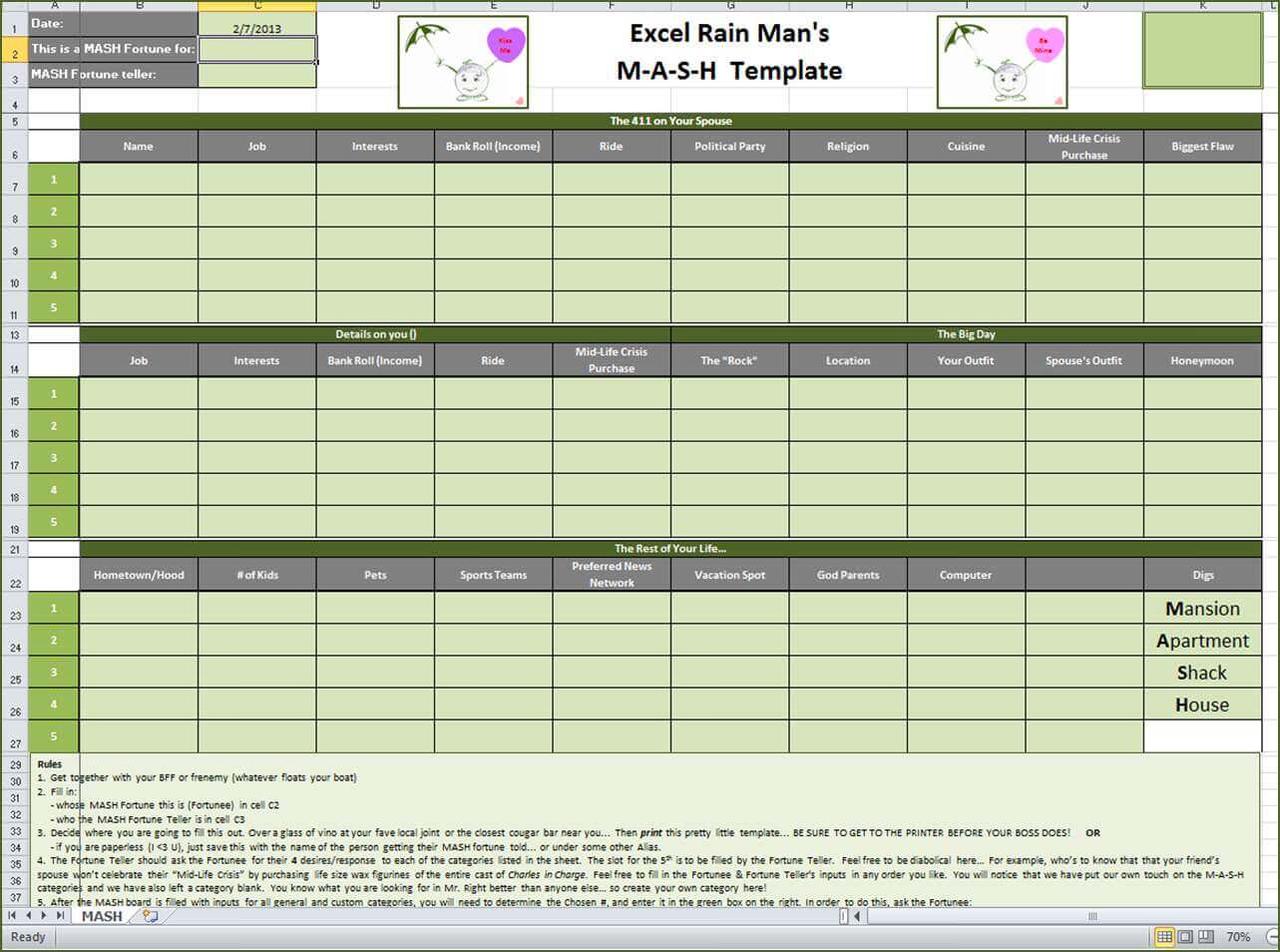

The Excel Rain Man M-A-S-H Template promotes lovin’ for both Mac and PC users ‘cause it’s the right thing to do!
So whether things get heated up this February with your US Heat Map or your love life takes an interesting turn due to your M-A-S-H fortune, get your priorities in gear and unload your spreadsheet work to the Excel Rain Squad.