
Who Charted? Charts PC 2007/2010
So perhaps it is time to take a break from all of the spreadsheet-related gambling emails and geek out with one of my favorite topics; creating column charts! Even the savviest of Excel users get a little weirded out around charts and plenty of folks just plain hate on charts altogether.
The good news is that charting continues to get better and better (i.e. quicker, easier and more professional) with each new version of Excel. And while I understand your pain, Excel Rain Man is still going to drop a quick charts lesson on you in the hopes that it will come in handy someday.
To access our quick how-to and to learn the difference between a Clustered Column Chart and a Stacked Column Chart, please check out our most recent blog posts (available for PC 2007/2010 below or Mac 2011 click here). Also, if you care to download the example file that is used in the lesson, visit the Tips & Tricks page of www.ExcelRainMan.com.
If none of this works and you would just rather outsource your charting… just Submit a Request and we will do it for you.
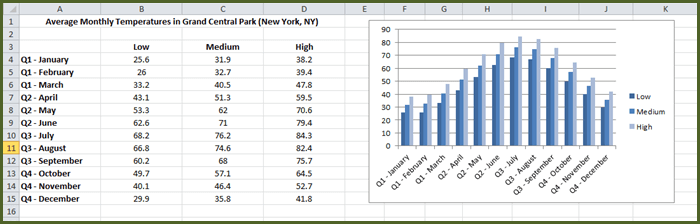
Clustered Column charts compare values across categories. A clustered column chart displays values in 2-D vertical rectangles. This is basically a simple chart that looks at more than 1 item across the x-axis.
For a simple Clustered Column chart:
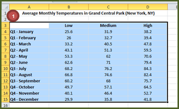
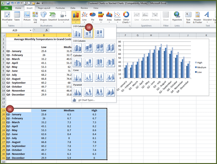
1. Highlight cells A3:D15
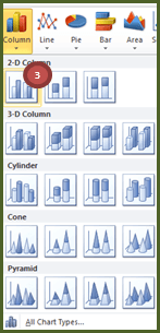
2. Insert tab, Charts group

3. Select Column dropdown, select Clustered Column (1st 2-D option on the left)
Result:
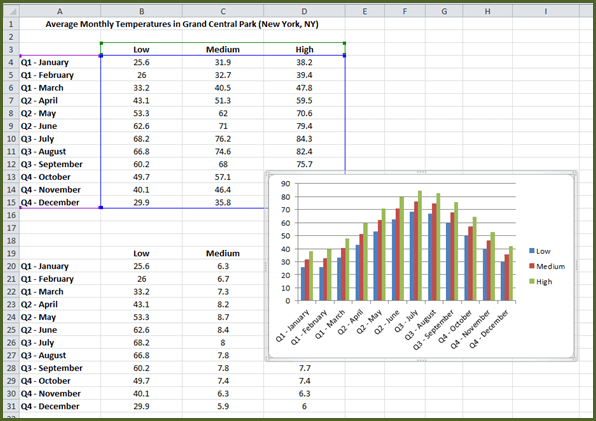
4. Then drag the chart so it is to the right of the data.
To quickly change the design of the chart:
5. Select the Chart on the right (notice the Chart Tools-specific tabs that appear: Design tab, Layout tab, Format tab)
6. Design tab, Chart Styles group, select Style 3 (all blue – 3rd option)
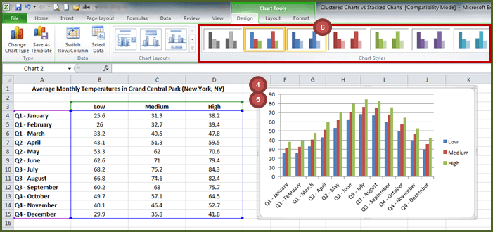
Result:
Stacked Column charts show the relationship of individual items to the whole, comparing the contribution of each value to a total across categories. A stacked column chart displays values in 2-D vertical stacked rectangles. This means they are stacking the compared items on top of each other in the chart (kind of like adding them up).
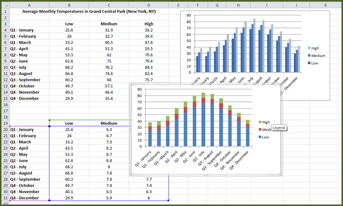
So, if we were to change this to a Stacked Column chart:
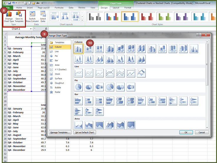
7. Select the chart on the right
8. Chart Tools – Design tab, Type group, select Change Chart Type
9. The Change Chart Type dialog box appears
10. Select Column, and select Stacked Column (2nd option from the top left), select OK
Result:
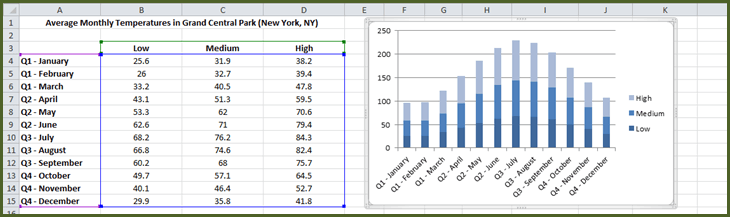
This does not make sense as we would not want to add the Low, Medium and High temperatures for each month. So let’s undo this by hitting Control Z.
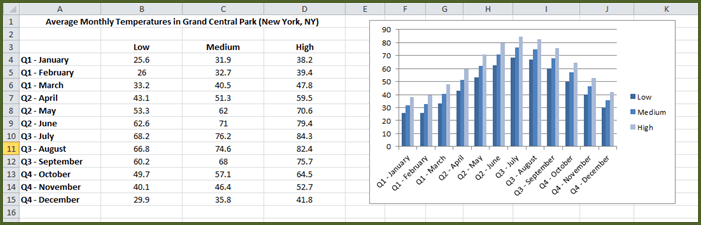
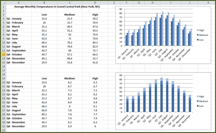
Let’s take a look at the data a little differently so it makes sense in the Stacked Column chart (see cells A19:D31)
Low temperatures are the same
The Medium column (C19:C31) is the Medium Temperature – the Low Temperature
The High column (D19:D31) is the High Temperature – the Medium Temperature
For a Stacked Column chart:
11. Highlight cells A19:D31
12. Insert tab, Charts group, select Column dropdown, select Stacked Column (middle 2-D option)
Result:
This Stacked Column Chart makes more sense in this instance as the low, medium and high temperatures line up with the corresponding degrees on the Y-axis.
You can drag the chart and change the design on the stacked chart to match the blue color palette in the column chart as we did above.

